White Toque needed to modernize without losing a mark its customers have trusted for decades. As Creative Director, I led the complete rebrand, refining the logo and building one cohesive identity across typography, color, art direction, photography, catalogs, print, digital and social. The result is a more contemporary, consistent brand that still feels unmistakably White Toque.

From pencil to logo.
Three kinds of light.
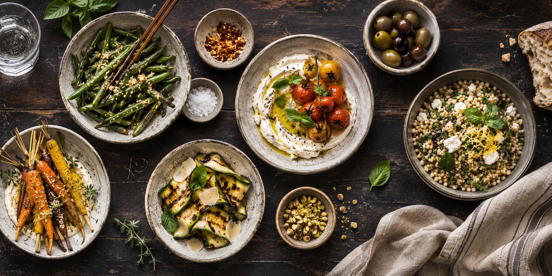
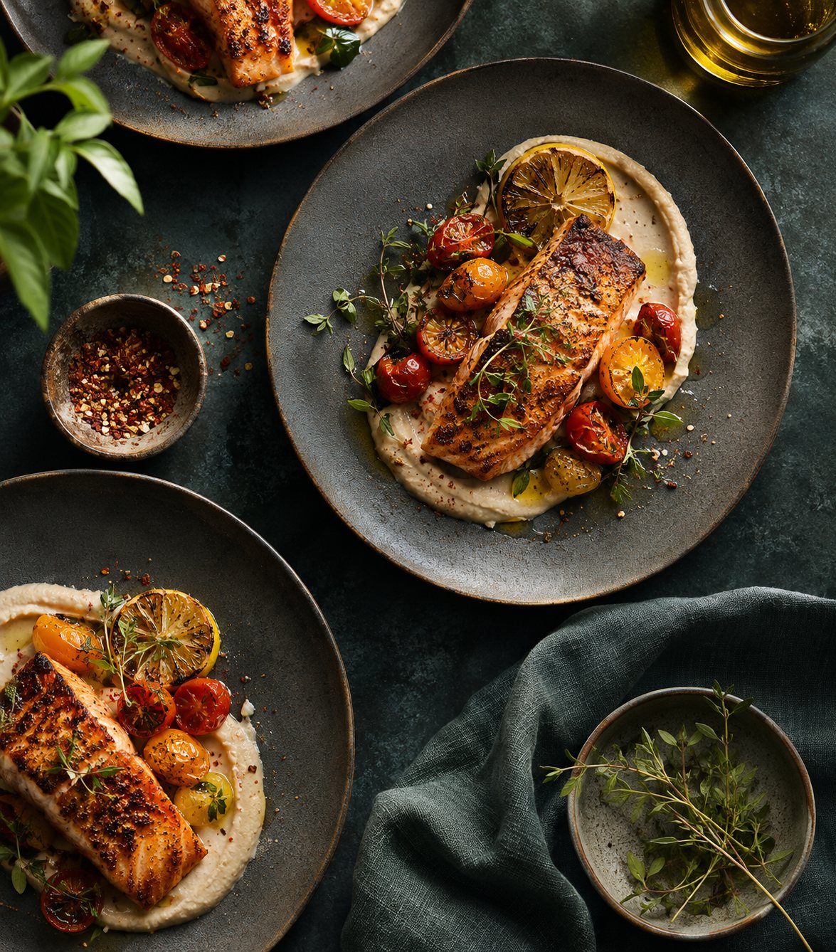
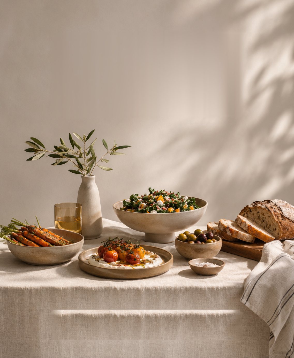
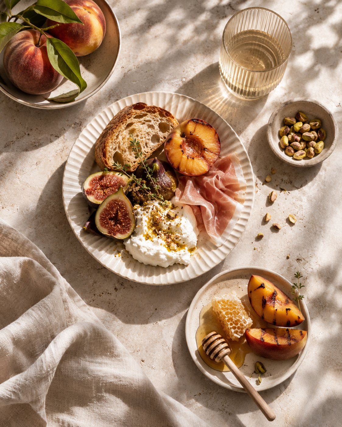
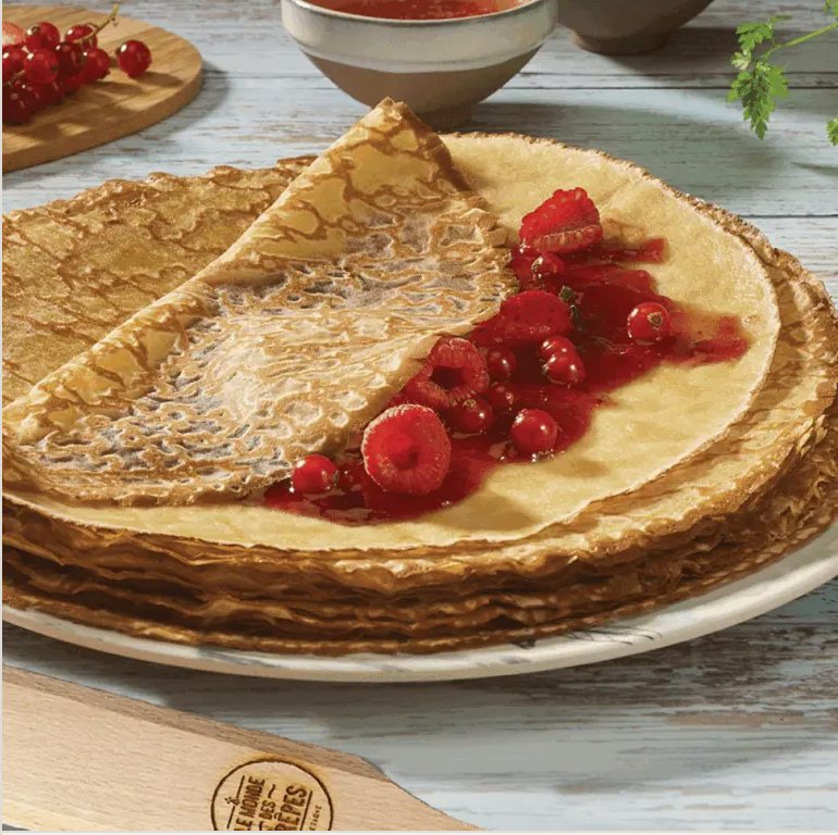
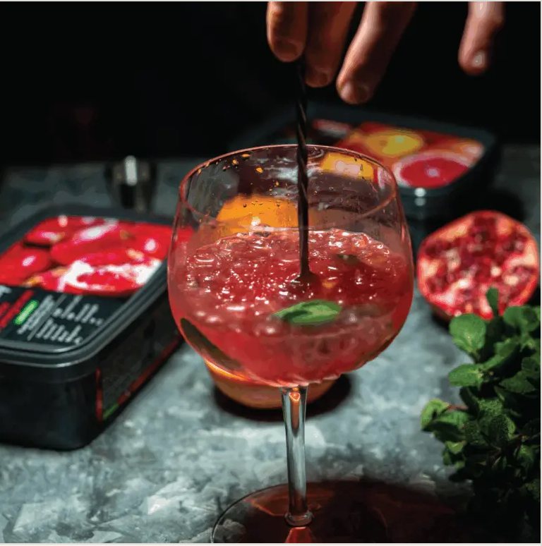
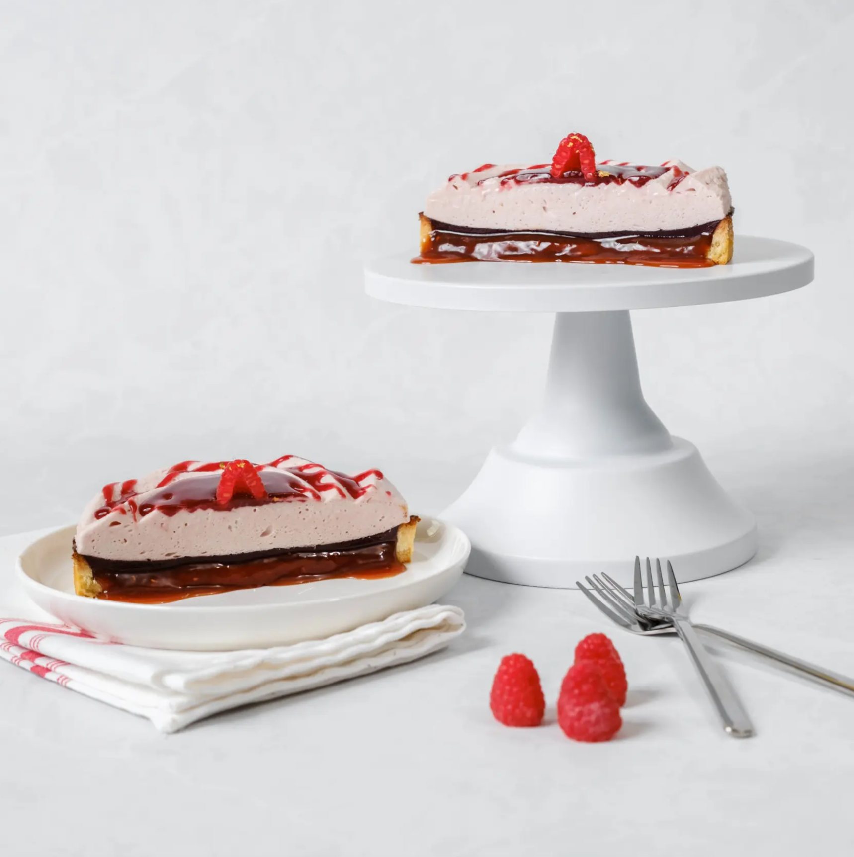
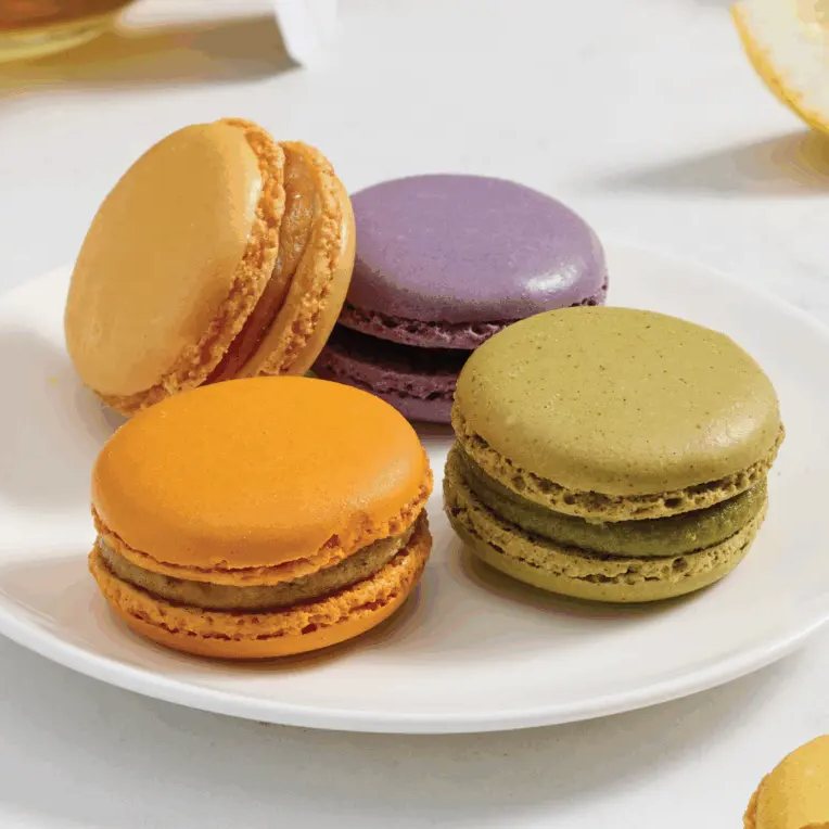
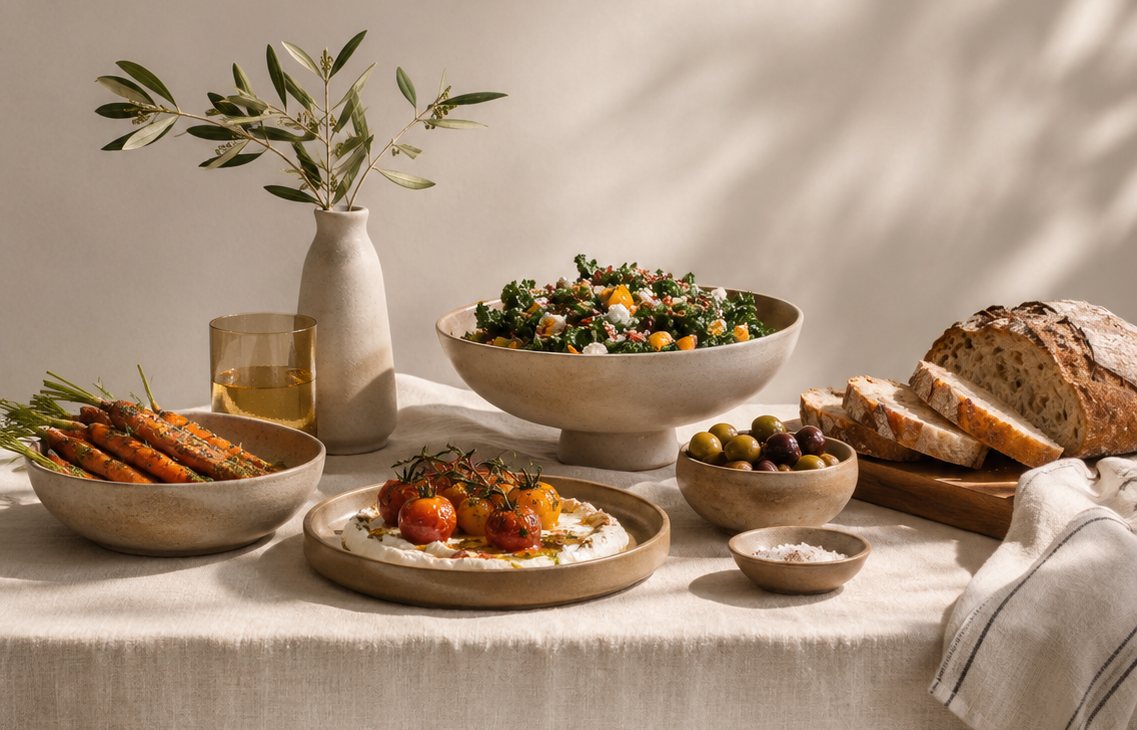
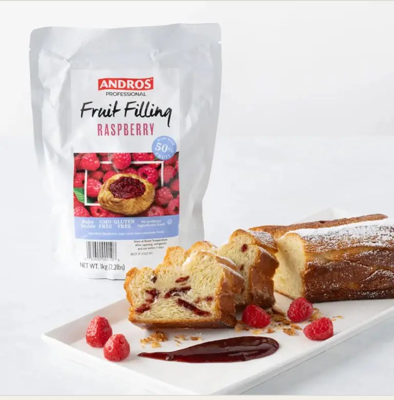
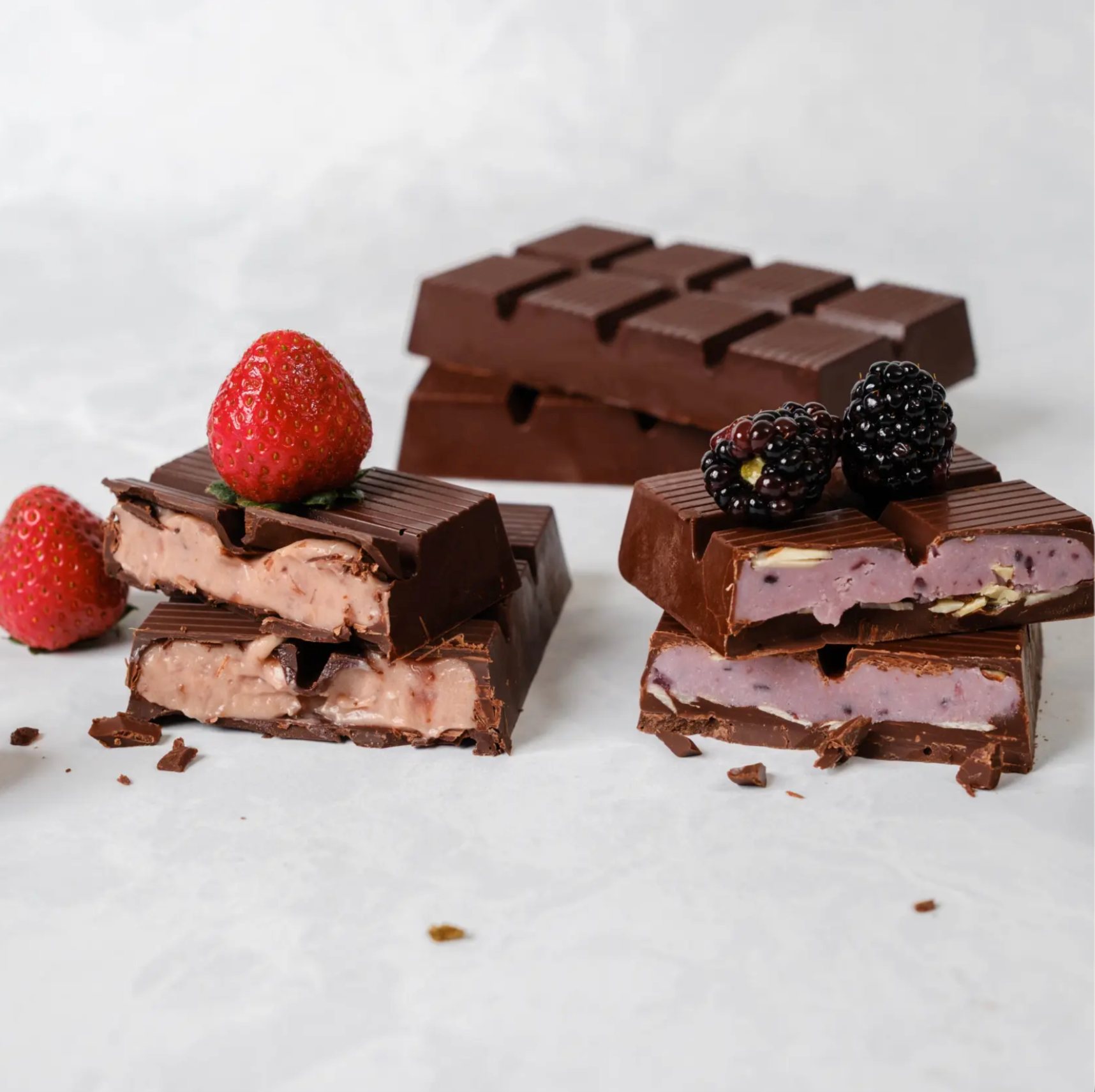
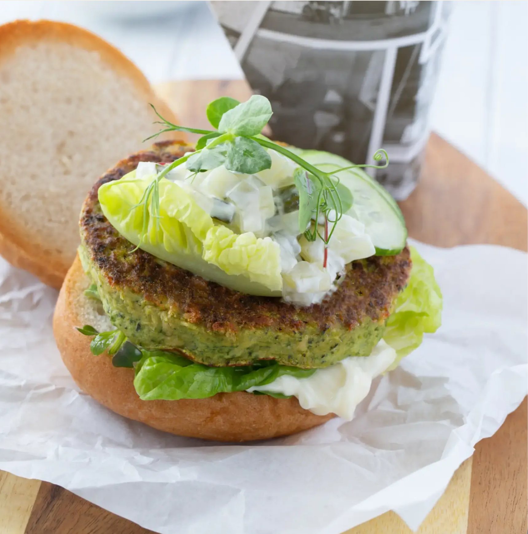
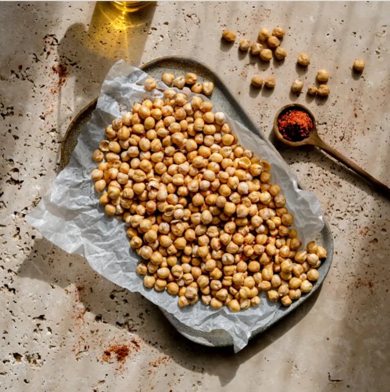
Photography is art directed by mood, not by product. Each mood has its own ground, palette and light, so every image belongs somewhere.
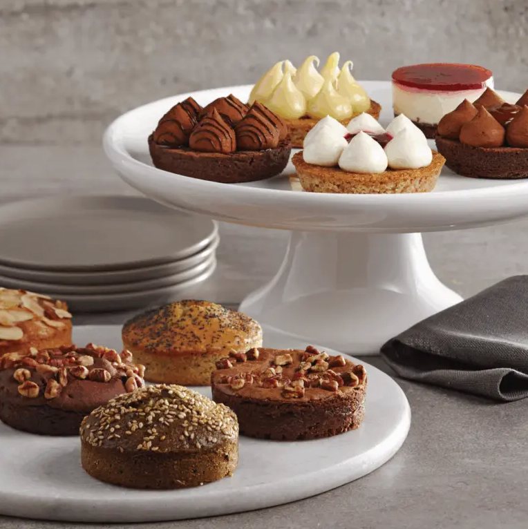
Built for the buyer’s desk.
Chapter openers sell the experience, product pages carry the specifications, and the price list is built for fast ordering. All three share one grid, one type system and square-cut photography.
An autumn–winter edition in the language of a culinary magazine: ivory stock, light display type, full-bleed spreads. It opens and turns on its own; click any page to browse.

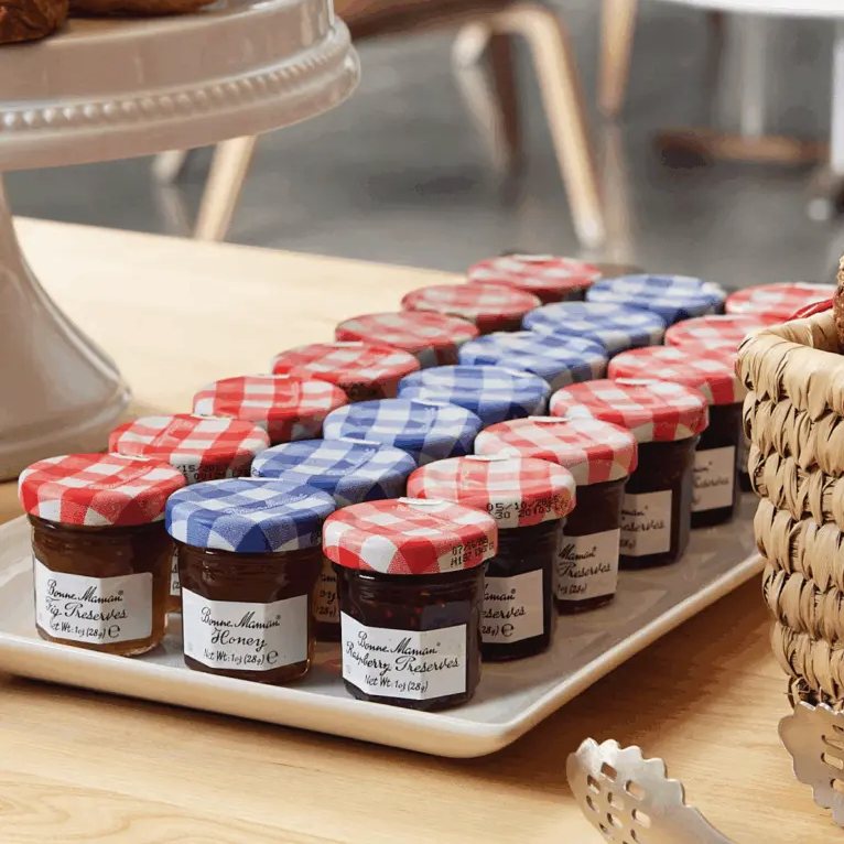
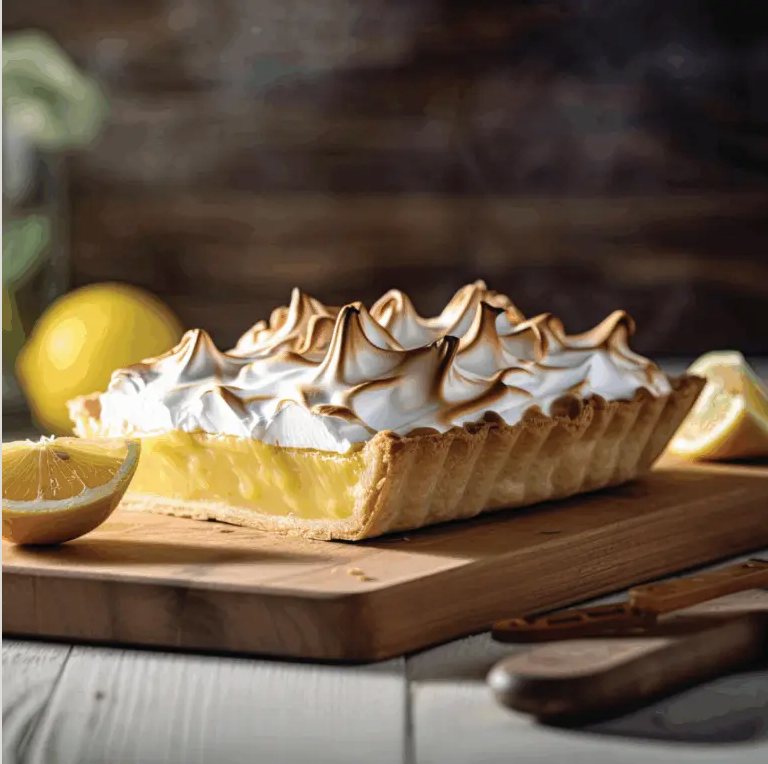
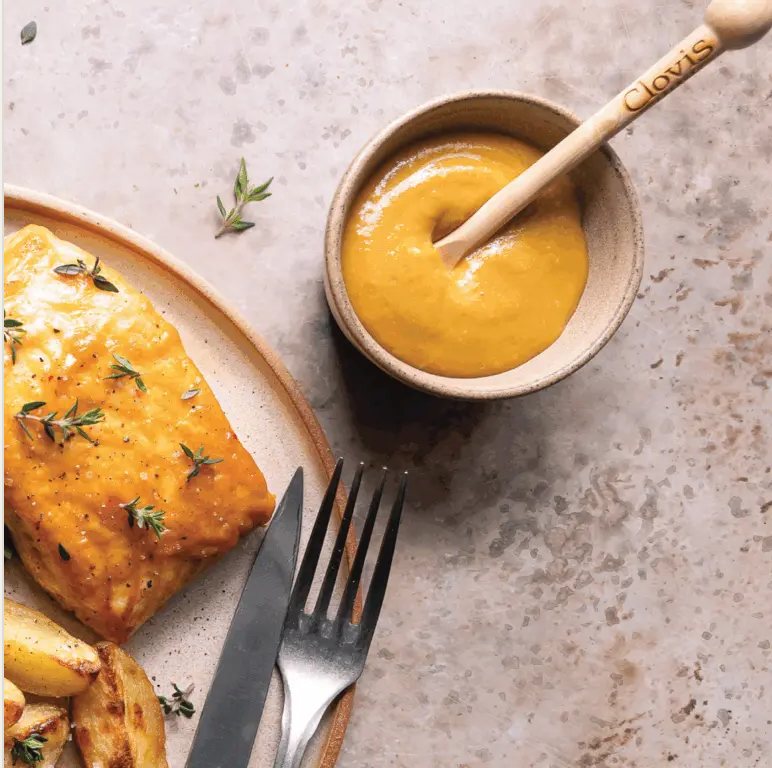
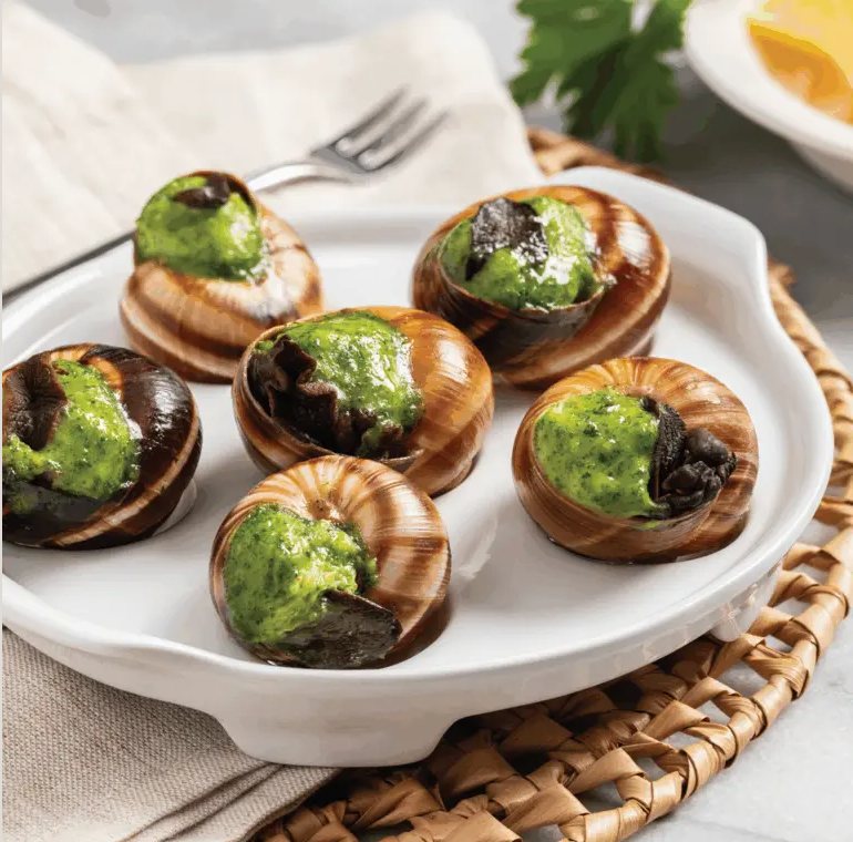
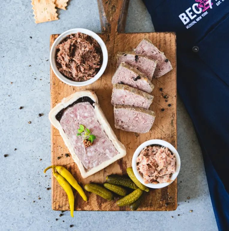
Each cover is a single editorial photograph with the logo in white or black and the fewest possible words.
One gesture, one toque.
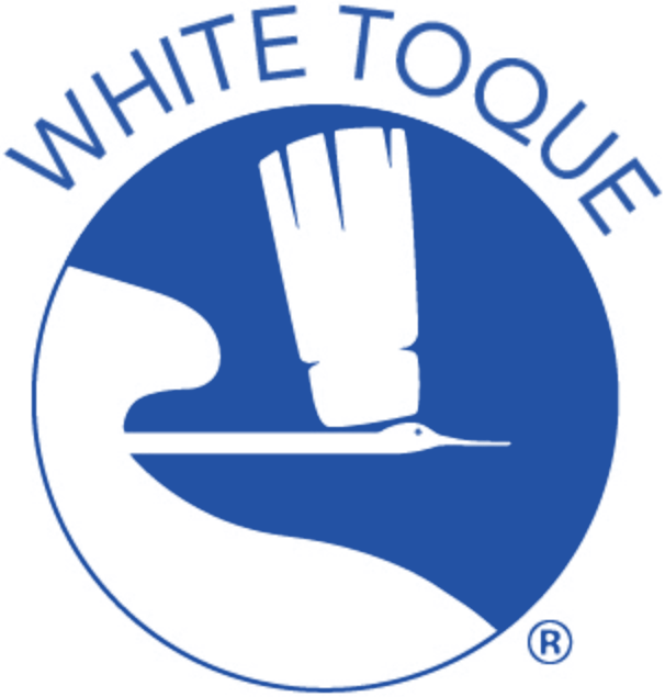
Drag across the mark to compare. The crane and the toque stay, so the recognition stays. Everything else is simplified to hold up at 48px on a screen or 40ft on a truck.
 96px64px48px · min
Sapphire leads.
Sapphire carries the brand; Toque Gold is a highlight for catalogs and calls to action. Cream and Ink are new supporting neutrals for modern layouts.
Avenir, with open tracking.
A quarterly price book for distributors: one row per item, a fixed column for item number and pack, and the case price aligned right. Hover a page to lift it.
A feed that reads like a magazine.
Eight concepts for @white_toque, with no logo on the canvas. The photography and the type carry the brand, and the movement is kept slow.
perfect.
FINEST PRODUCERS
one table.
one table.